How Colors Affect Our Moods and Why You Shouldn’t Paint Your Living Room Yellow
There is no debate that color preference is a very personal matter, especially when choosing what colors you want to see when you come back home. However, some colors can have a great impact on the overall mood of a home. In this article we want to share our knowledge about color and help you in your search of the perfect paint color.
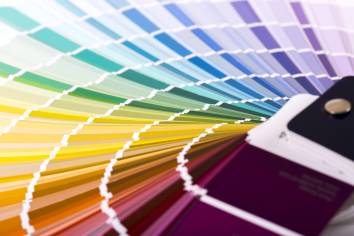
Choosing the right colors for your interior
Painting your interior, as many experts believe, is much more than just picking up the first bucket of paint that looks appealing and applying it to your walls. Color consultants often advise their clients to truly analyze how a color makes them feel, and not simply go with design trends.
Of course, color preference depends strongly on each individual’s experience, but some colors tend to have similar mood effects on most human beings. For example, warm and earthy colors in your foyer can make your guests feel welcome before you even say “hello”, and a solid blue dining room can leave your amazing cooking unappreciated. You can harness the power of colors and use it to make your home a well thought out oasis in which you will feel happy and refreshed.
Read the article below and find out which colors are best suited for which areas in your home.
Red
This vibrant and dramatic color has a stimulating, warm effect. Being the most intense color of all, red has the quality of raising energy levels, it is confident and bold. This color is known to draw people together and encourage conversation, and for its appetizing qualities, red is often used in restaurants. However, if you like to watch your calorie intake, painting your kitchen red might not the best idea, as it can prompt you to eat a little more.
Red paint is an excellent choice if you’d like to bring some excitement to your living room. When used in dining rooms, this color can make your guests think that you’re a better cook, and a red foyer is a sound choice if you want to create a strong first impression. Even though it is thought to be too stimulating for bedrooms, this color looks rich and deep in lamplight.
Great for: Dining rooms, living rooms, foyer.
Avoid in: kitchen.
Blue
Blue has the opposite effect to the color red. Resembling clear summer sky and calming waters, this color is relaxing, peaceful and serene. Blue brings inspiration, strength and people tend to be more productive in rooms with blue walls, making it perfect for offices. This color also has a tendency of reducing body temperature and blood pressure and it might look chilly in rooms that don’t get much sunlight. However, a deep blue room can look rich and elegant when paired with warm colored furniture and decorations.
To encourage relaxation in social areas, consider warmer and softer shades of blue, such as periwinkle, turquoise or cerulean. However, since blue is so rarely found in natural foods, it is deemed the least appetizing color, so we advise not to choose this as a main color for your dining room.
Great for: home office, bedroom, bathroom, living room.
Avoid in: dining room.
Purple
Purple is a great alternative to blue, as it has the same calming effects without the risk of making your room feel cold. Deep, dark purple is sophisticated, often associated with luxury and creativity, and this color gives depth to a room when used as a secondary color. Since it’s rare in nature, this color can appear mysterious and exotic.
Lighter shades of purple have restful qualities and will bring calmness to your home. However, since this color tends to stimulate the brain, we advise to avoid it in bedrooms.
Great for: bathroom, living room.
Avoid in: bedroom.
Green
Green is considered to be the most refreshing and restful color, most likely because it is so common in nature. Green brings harmony and peace, and being in the center of the color spectrum, it is the color of balance. Green is perfect for nearly any room of the house where you want to encourage unwinding and stress relief.
This color has a relaxing, calming effect and some studies even suggest that it increases fertility, making it a great choice for the bedroom. Green is also associated with money, and a blue-green is perfect for an office since it both reduces anxiety and increases work performance.
Yellow
Yellow is a happy color that resembles sunlight and careless summer days. Yellow can bring warm and joyous feelings, but it’s not the best idea to choose it as a main color for any room. Being one of the most intense colors of the spectrum, bright solid yellow causes irritation and frustration. It has been reported that people are most likely to lose their temper in a yellow room, and even babies usually cry more when they are in a yellow room.
However, yellow details and decorations create a cheerful atmosphere and have an energizing effect. When used in moderation, this color can do wonders in bathrooms, entryways and other small spaces.
Great for: decorating bathrooms, entryways, small spaces.
Avoid in: excessive amounts.
Neutral colors
Gray, white and black are the most flexible colors, that are widely used by interior decorators. These colors can add life to a room as well as complement brighter colors, neutralise them or create a smooth transition.
A creamy gray can accent your wooden kitchen cabinets or window frames, and white is a simple and classy choice for a clean and airy atmosphere. Painting a room a solid black can sometimes seem as a tempting idea, however it’s advised to use black only to accent a certain area or give depth to the space.
Don’t forget the ceiling
It’s very common to simply paint the ceiling white and be done with it. However, painting your ceiling a different tone can create a completely different atmosphere. Ceilings that are darker than your walls can visually lower your ceiling, thus creating not a claustrophobic, but rather an intimate, cozy atmosphere. A lighter ceiling tone will visually expand your room and make it seem more airy. If you’re a bit shy about painting your ceiling a dramatic color, choose a very light tone of a color that complements your wall paint.
Don’t be afraid to experiment. Interior painting is one of the cheapest and most exciting ways to improve the look of your home, and you can always repaint it if you change your mind about a color scheme.
However, if you’re still unsure about which color scheme would best suit your home, experienced and creative interior painting professionals are just a phone call to Pro Painters away. We can help you choose between all of the shades and hues, and refresh your home with a coat of fresh paint.
